Date picker
Date and time pickers allow users to select a single or a range of dates and times.
Variations
| Type | Purpose |
|---|---|
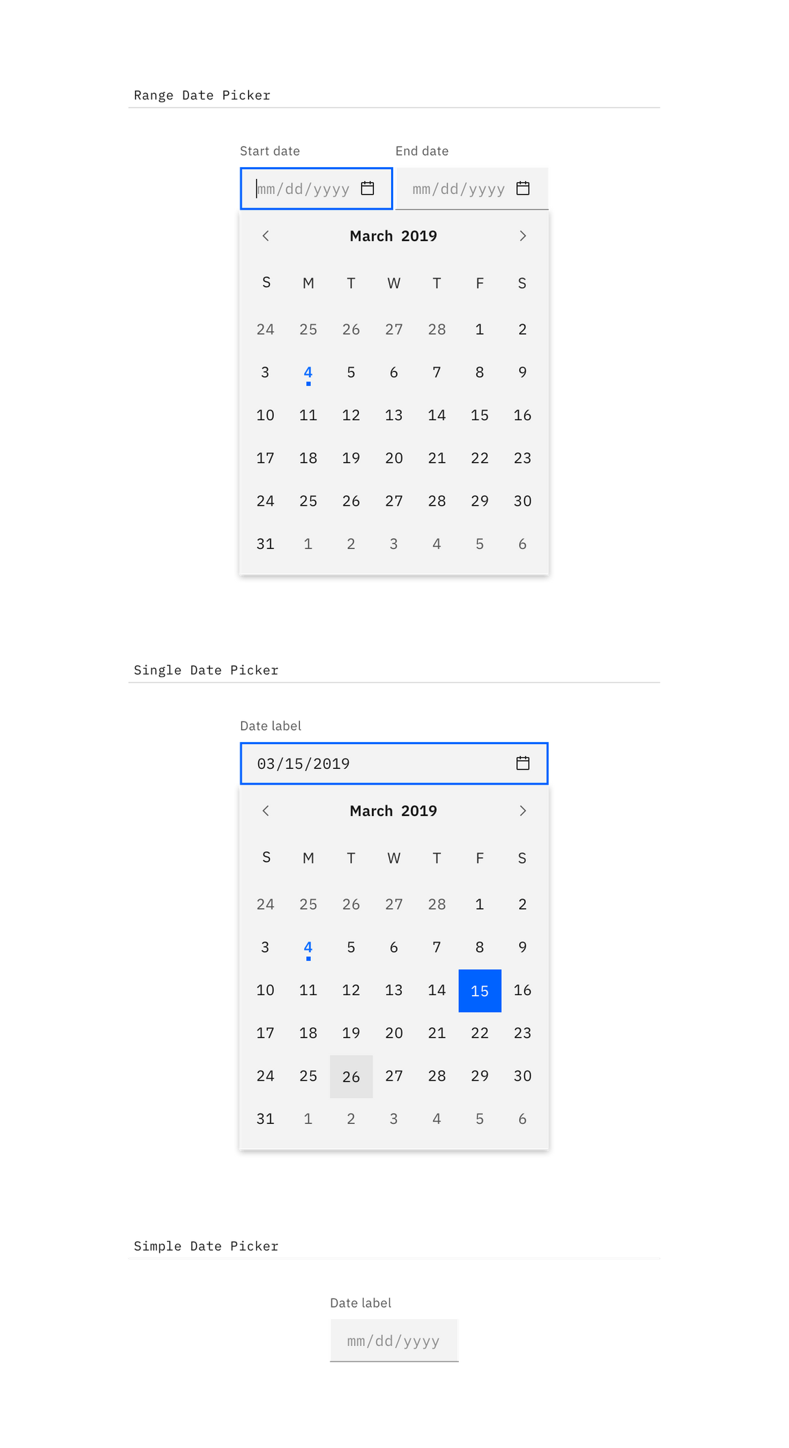
| Range date picker | To select a range of dates, accompanied by a calendar widget. |
| Single date picker | When a user needs to select one date, accompanied by a calendar widget. |
| Simple date picker | When the date is known by the user and they don’t need a calendar to anticipate the dates. |

Types of date pickers
Content
Labels
Both date and time pickers are accompanied by labels, and follow the same accessibility guidelines for all forms.
Format
For date pickers, use placeholder text so users input the date in the correct format. It can be formatted in a variety of ways. See the date picker code documentation for more info.
Interaction
Calendar widget
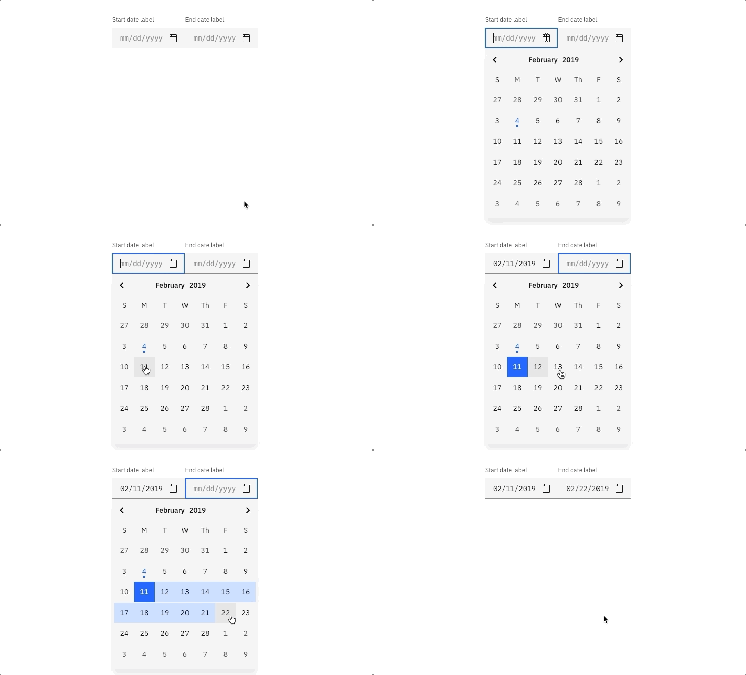
It is recommended to use the date picker with a calendar widget when the user is browsing between a range of dates. Aid the user in making the proper choices by providing a visual reference of dates to choose from. The calendar widget appears once the user has interacted with the date input field (typically on :focus).

Selecting dates from the range date picker
Simple date picker
The simple date picker provides the user with a text input in which they can input month/day/year. Simple date pickers are typically used when the date is known by the user, such as a birthday or credit card expiration.
Time picker
Time pickers provide the user with a text input in which they can input hours/minutes. Additionally, they can be accompanied by an “AM/PM” selection and a time zone selection, which is styled as an inline select.